
THE PROJECT
Two Facades, One SOYVALVE Identity.
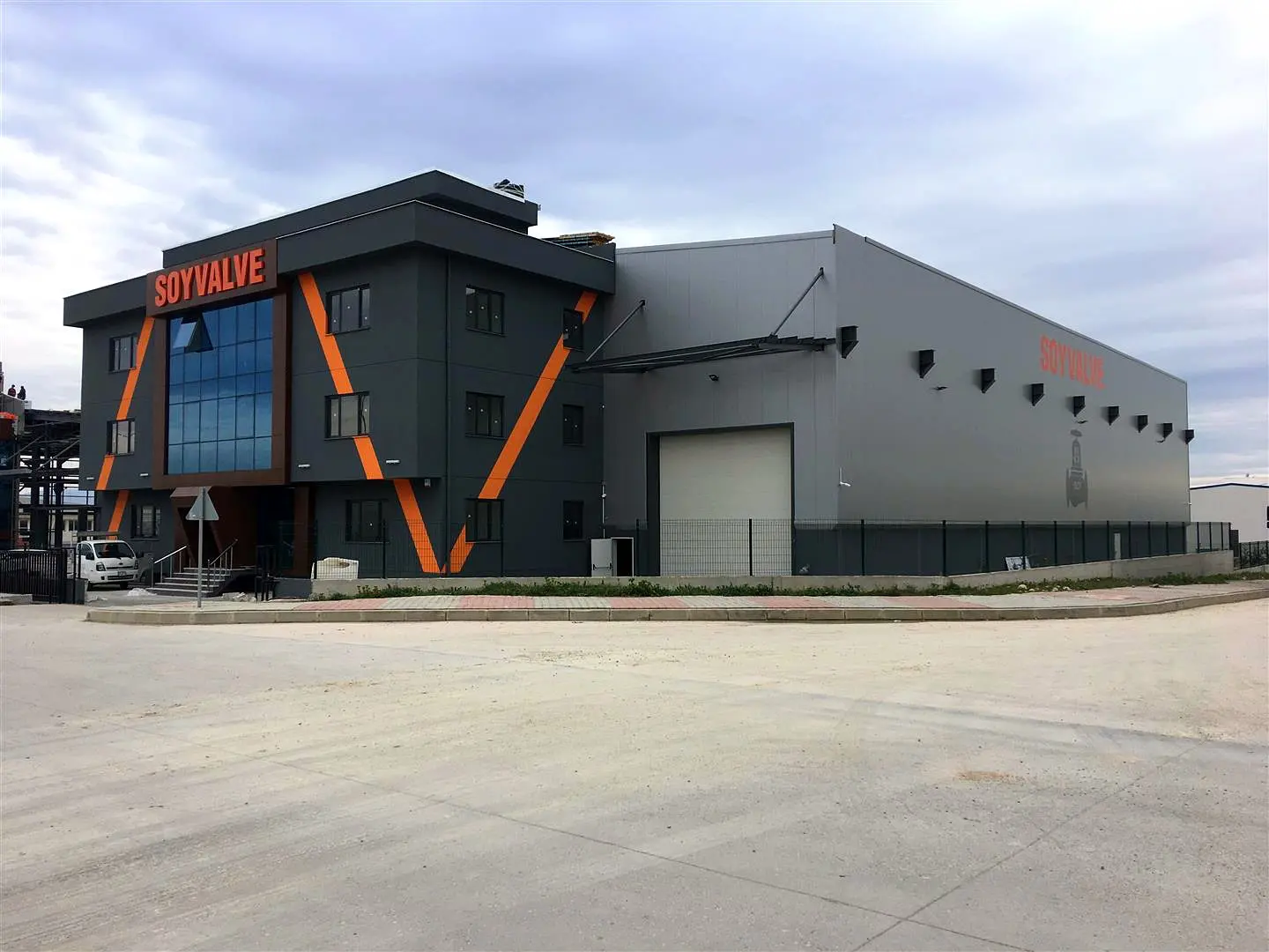
The SOYVALVE factory uses its exterior to identify both the main entrance and the longer side elevation. Boran Reklam produced orange aluminum box letters for the dark entrance facade and applied large-scale SOYVALVE lettering by painting the light-colored side wall.
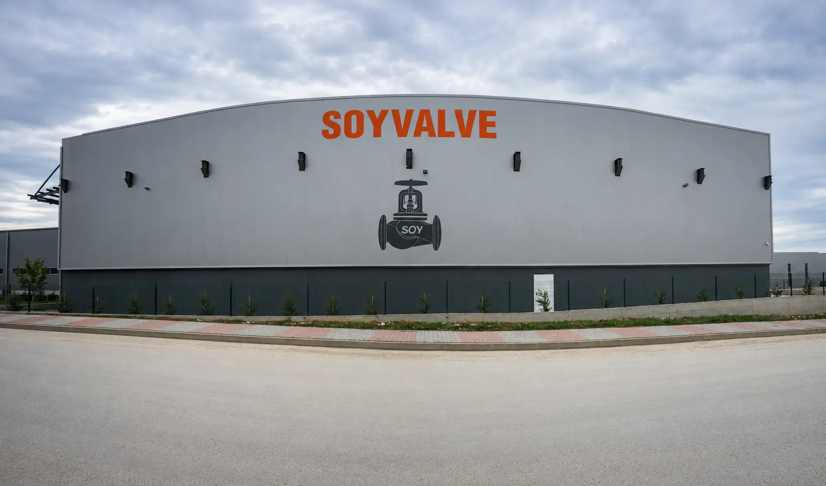
The wide exterior photograph shows the two treatments together and how each responds to a different architectural surface.
2
Complementary facade treatments
Aluminum
Dimensional entrance letters
Paint
Large-scale side-wall lettering
Orange
Color linking both elevations
THE CHALLENGE
A Clear Entrance Sign on a Dark Facade.
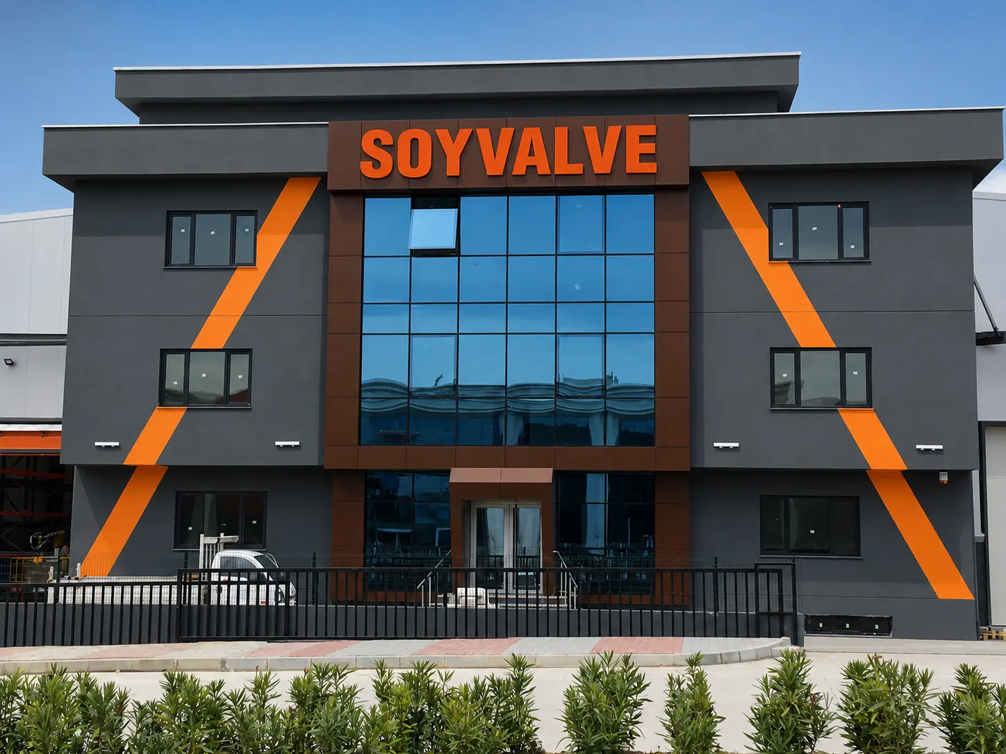
The entrance combines dark cladding, reflective blue glazing and diagonal orange accents. Its sign needed a clear position within that composition. Dimensional aluminum letters place the SOYVALVE name above the glazing, while the orange finish relates to the existing facade accents.


THE SOLUTION
The Right Sign for Each Building Surface.
The main entrance and side wall call for different ways to display the same name. Above the blue glazing, SOYVALVE appears as orange aluminum box letters on a dark panel, adding depth and a clear focal point. On the long, pale factory wall, the name is applied as large painted letters.
Using the same orange brand color across both elevations connects the raised entrance sign and the painted wall lettering, while allowing each to work with its own surface.
PAINTED FACADE
Painted Lettering Across the Side Elevation.
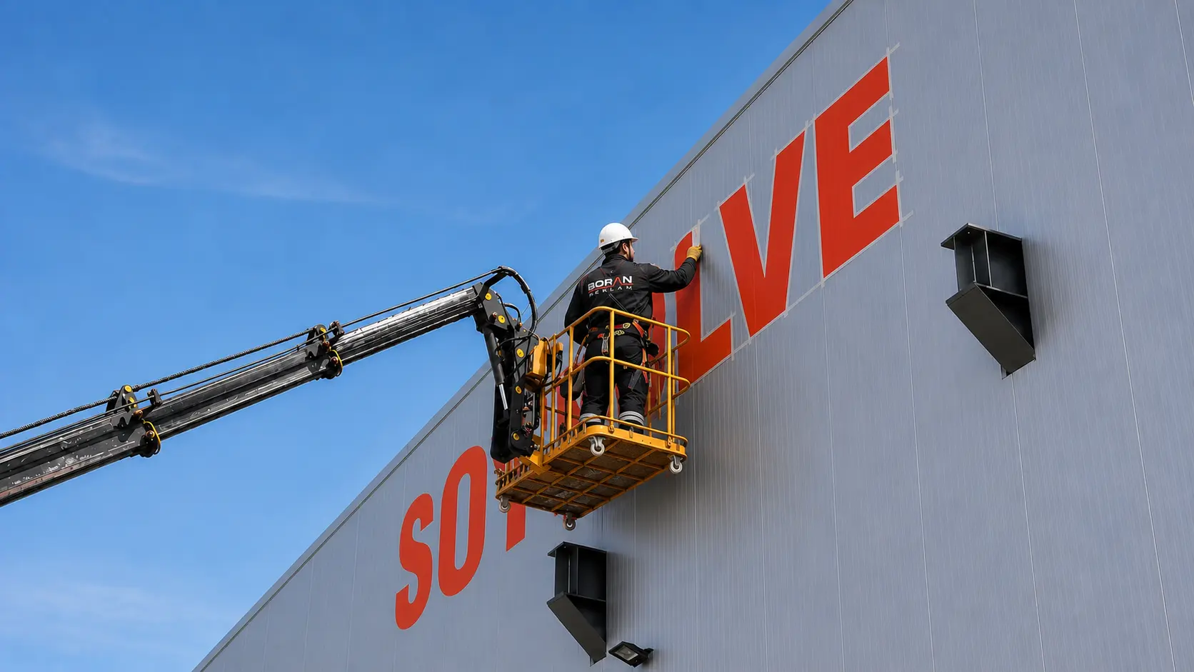
On the broad side elevation, the brand takes a different form. Large orange SOYVALVE lettering is painted directly onto the light wall, with a valve graphic visible beneath the name. The long view shows the scale of this application relative to the building and surrounding street.
The painted treatment keeps the letters flat to the wall while giving the long facade a clear identity.
INSTALLATION PROCESS
On-Site Application at Height.
The installation photograph shows a Boran Reklam team member working on the large side-wall lettering from an aerial platform. Applying the name across the factory elevation required the letter positions and edges to be handled at building scale. The image records a stage of the facade lettering work.
THE RESULT
A Recognizable Factory from Two Approaches.
At the entrance, raised orange aluminum letters identify the main building face. Along the side elevation, the painted SOYVALVE name extends the identity across a much larger surface. Together, the applications make the brand visible on the factory’s contrasting dark and light facades.
FEATURED CASE STUDIES
Real Projects. Real Results.
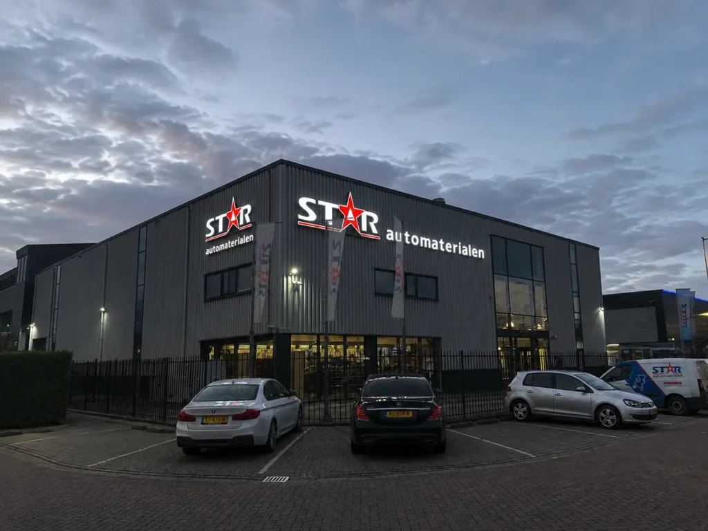
STAR Automaterialen Signage in the Netherlands
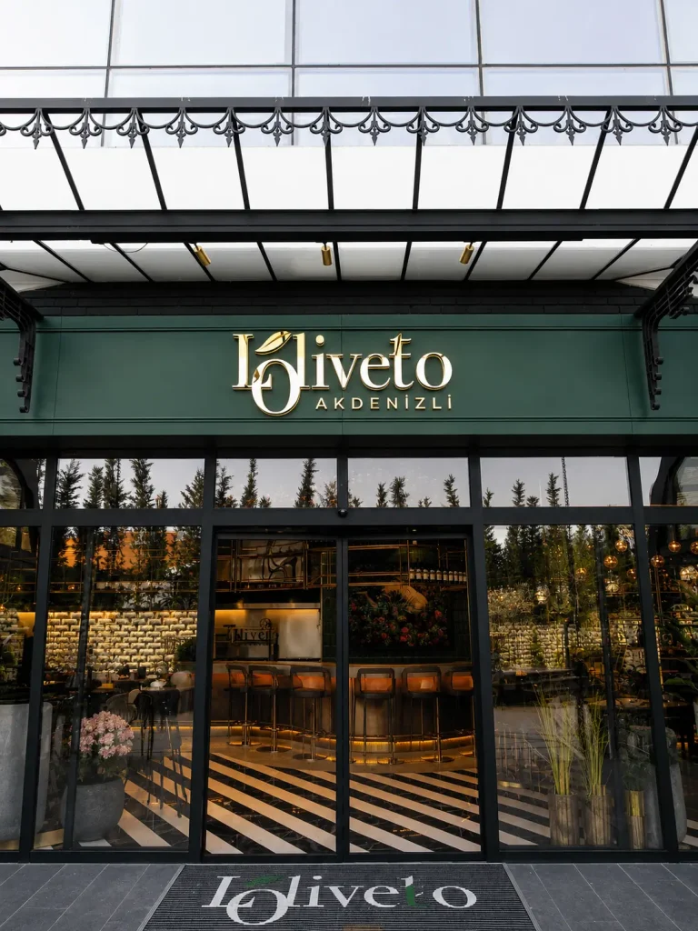
Loliveto Halo-Lit Signage
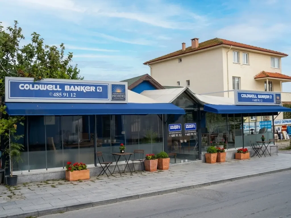
Coldwell Banker Custom Fascia Signage
Godiva UAE Interior Signage & Metalwork

Technogym Astana Retail Graphics & Installation

Glatz Exhibition Graphics & Signage

Triathlon – Shopping Mall Signage & Lightbox Project
Efectis Factory Signage & Hand-Painted Logo
Holiday Inn Parking Pylon Sign
İskefe Industrial Building Signage
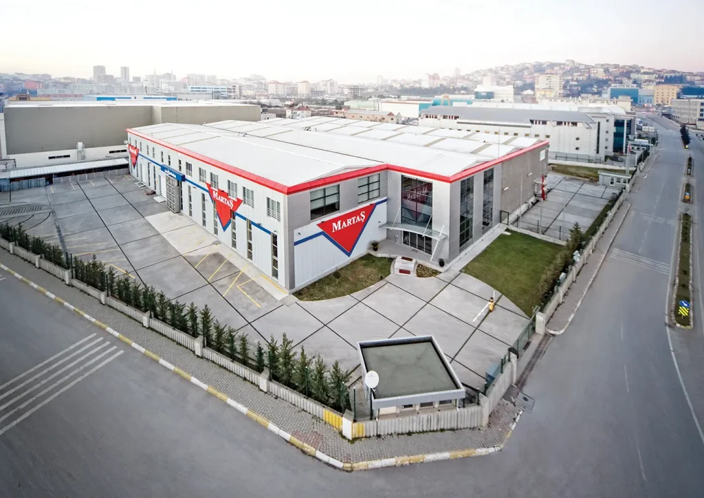
Martaş Factory Façade Signage
