THE PROJECT
A Signage Journey from Parking to the Restaurant.
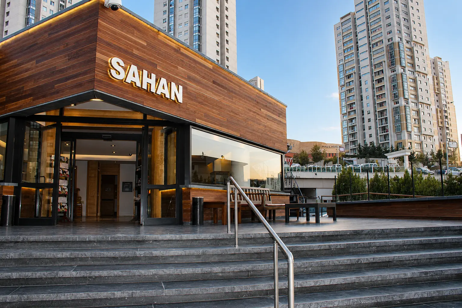
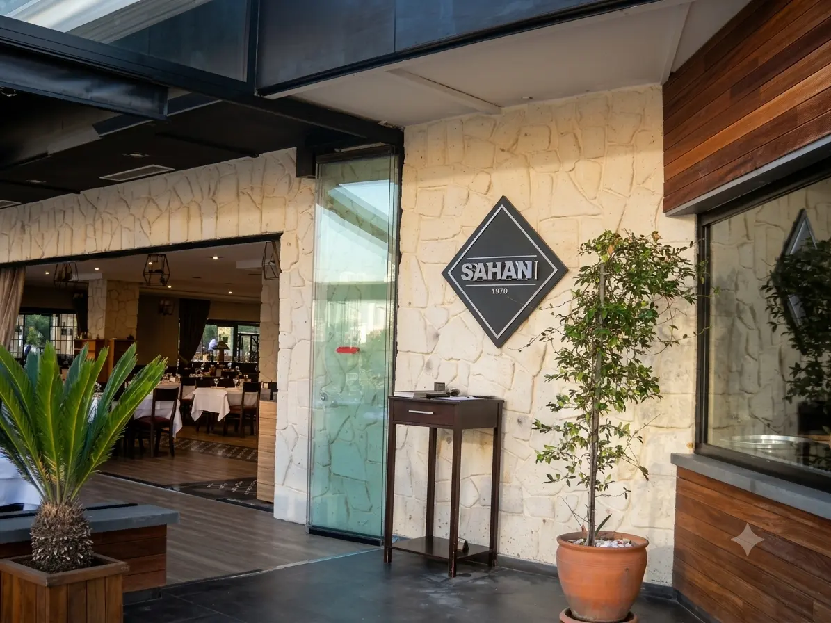
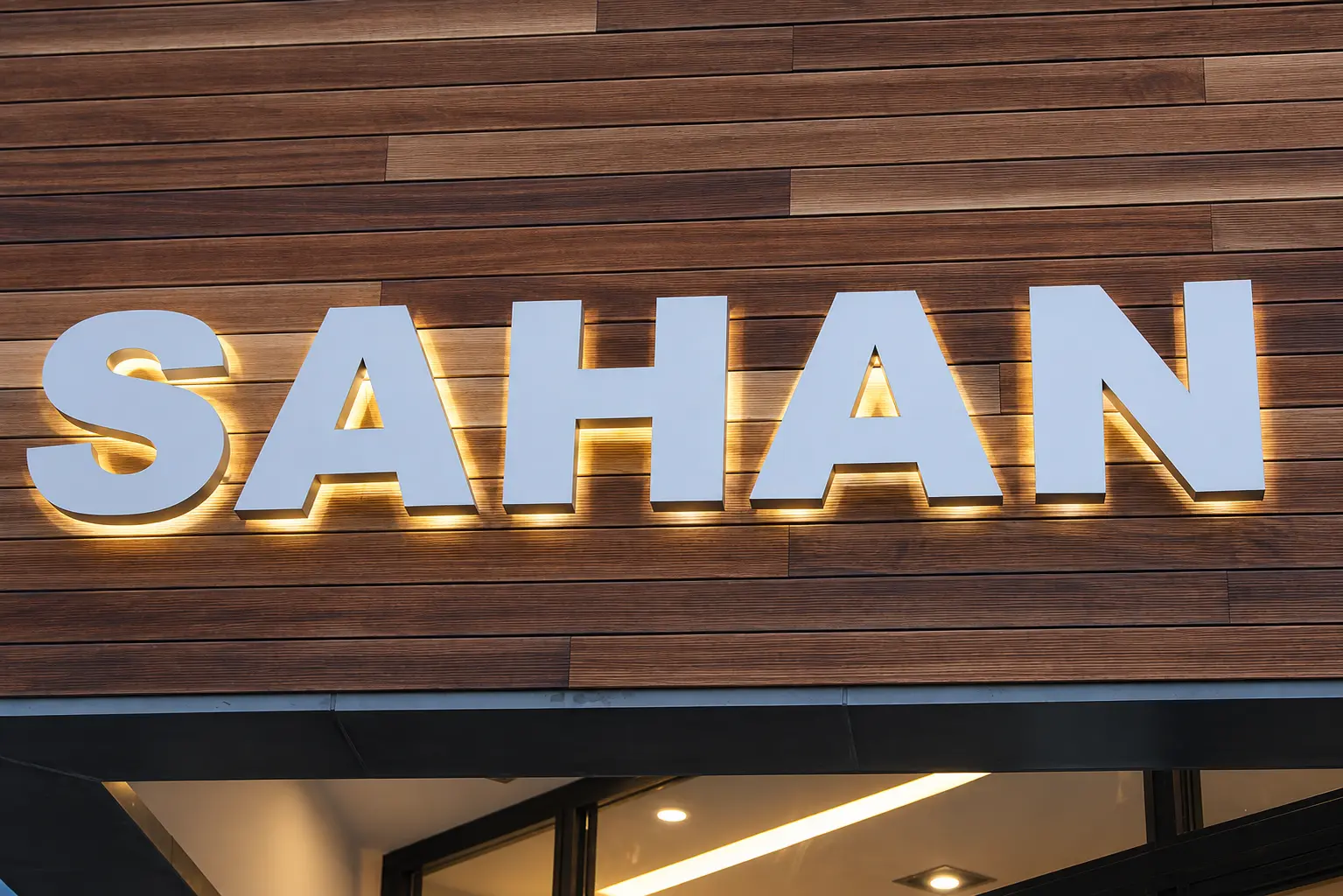
Boran Reklam produced a coordinated signage package for Sahan. At the arrival point, a freestanding panel identifies customer parking. Closer to the restaurant, the diamond-shaped Sahan emblem marks the entrance. On the wood-clad façade, stainless steel box letters spell out the name with a warm halo of light.
The applications serve different viewing distances while carrying a consistent Sahan identity.
3
Coordinated signage applications
Halo
Backlit façade letters
Steel
Dimensional entrance signage
Arrival
Customer parking identification
THE CHALLENGE
Clear Guidance Without Losing the Restaurant Identity.
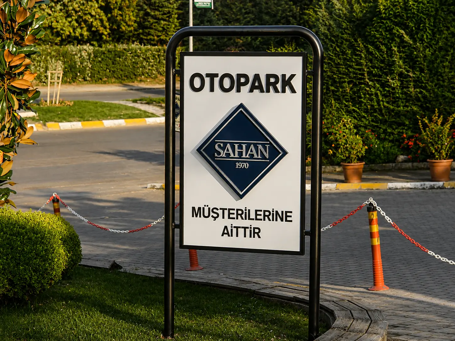
Visitors need to recognise where to park before they reach the entrance. The white parking panel gives “OTOPARK” the strongest position, places the Sahan emblem in the centre and reserves the lower area for the customer-only message.
At the building, the signage has a different role: identify the restaurant in a way that fits the wood, stone and glass surroundings.


THE SOLUTION
One Brand, Three Signage Roles.
The parking sign, entrance emblem and façade letters each answer a different visitor need. The parking panel communicates access information at the drive; the diamond-shaped Sahan sign confirms the entrance; the halo-lit name becomes the main architectural brand feature.
Stainless steel detailing ties the entrance applications together, while the larger wood façade gives the illuminated letters a warm background.
LETTER DETAIL
Stainless Steel Letters with a Warm Halo.
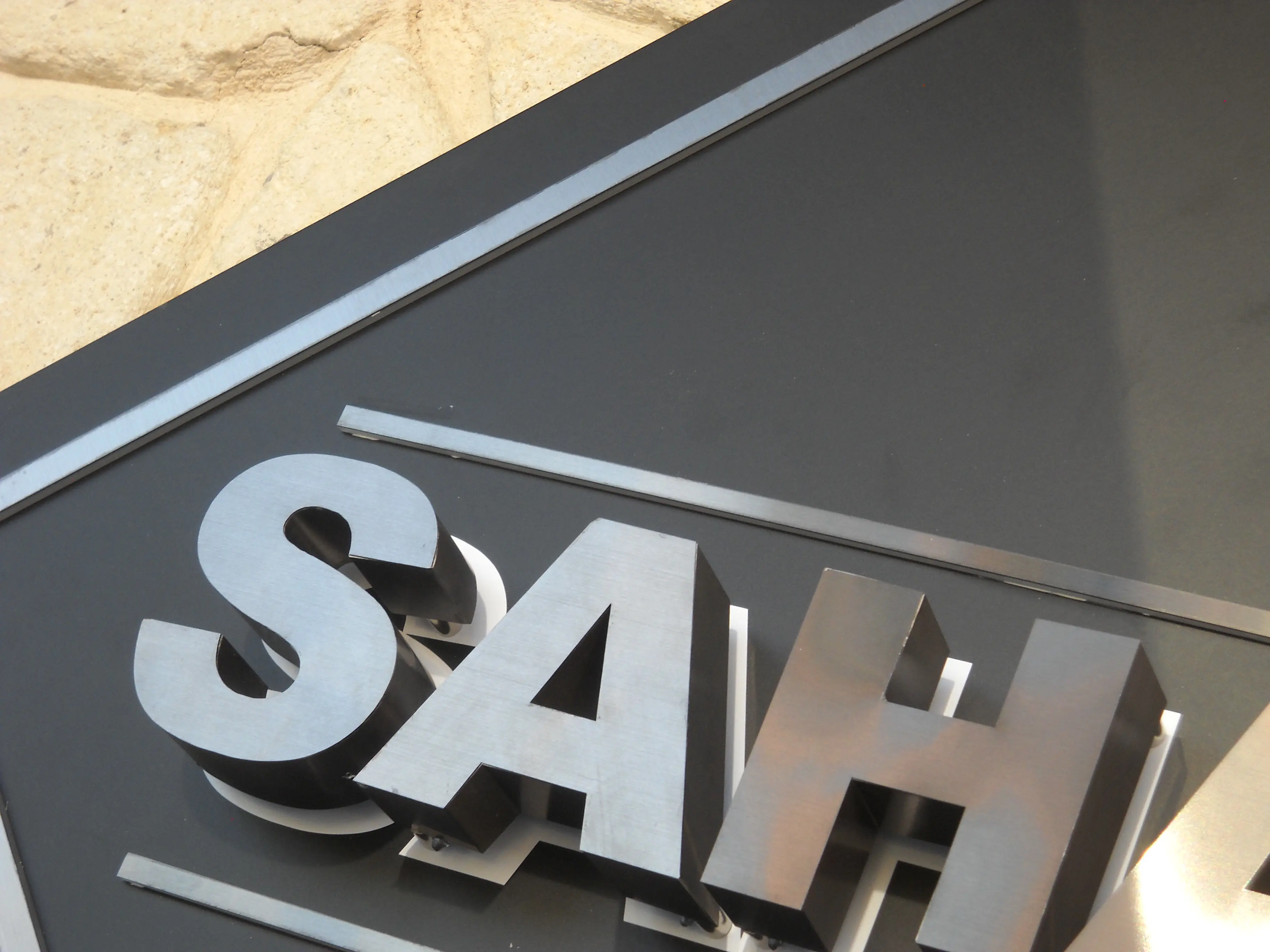
The close-up photographs show the depth and metal finish of the SAHAN box letters. Mounted on the wood-clad façade, they stand clear of the surface so warm light can form a soft halo around each character.
The restrained letter forms and backlighting keep the entrance name legible while complementing the building materials.
ENTRANCE EMBLEM
A Stainless Steel Sign at the Doorway.
The diamond-shaped Sahan sign is mounted on the light stone wall beside the restaurant entrance. Its dark face and metallic lettering present the brand at pedestrian distance, connecting the arrival signage with the illuminated name on the façade.
FACADE IDENTITY
A Welcoming Sign Above the Entrance.
Across the wood-clad frontage, the halo-lit SAHAN letters sit above the main entrance. Their white faces remain visible in daylight, while the warm backlighting outlines the name against the timber surface. The wide view shows how the sign works with the entrance steps and surrounding architecture.
THE RESULT
One Identity Across the Restaurant Grounds.
The completed signage guides guests from the customer parking area to the restaurant entrance. The diamond emblem provides a second point of recognition at the doorway, while the halo-lit stainless letters give the façade a clear and welcoming identity.
FEATURED CASE STUDIES
Real Projects. Real Results.
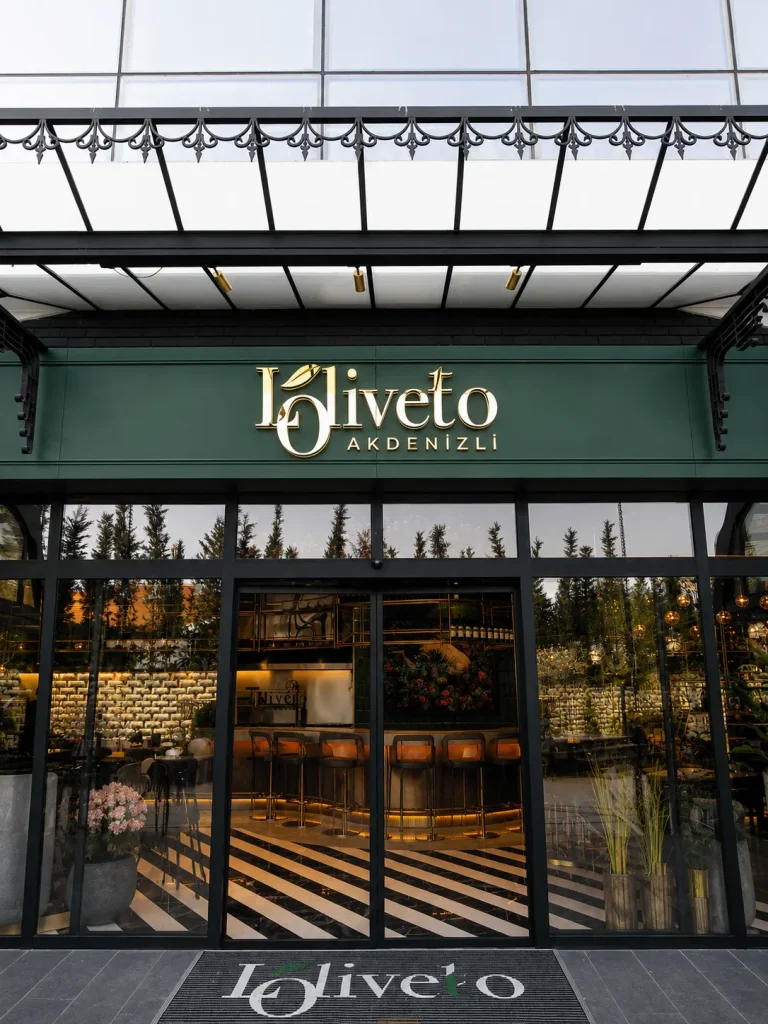
Loliveto Halo-Lit Signage
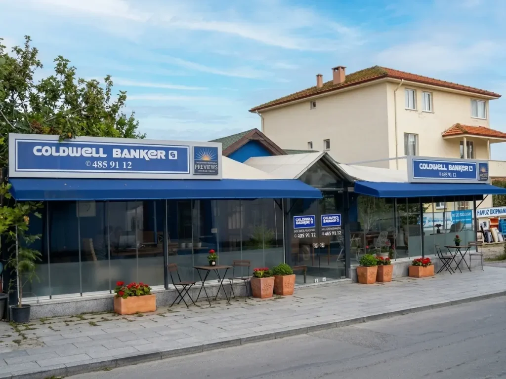
Coldwell Banker Custom Fascia Signage
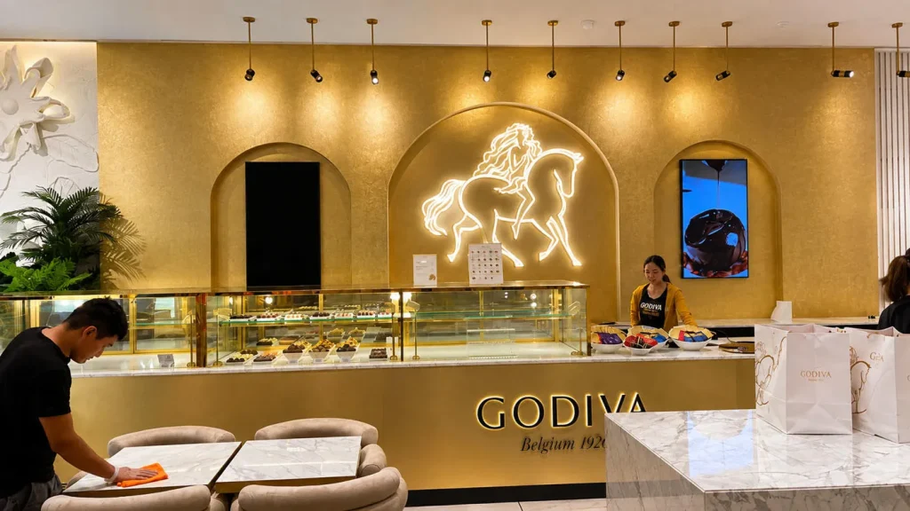
Godiva UAE Interior Signage & Metalwork

Technogym Astana Retail Graphics & Installation

Glatz Exhibition Graphics & Signage

Triathlon – Shopping Mall Signage & Lightbox Project

Efectis Factory Signage & Hand-Painted Logo
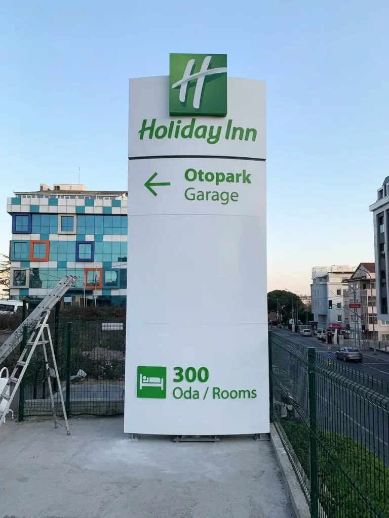
Holiday Inn Parking Pylon Sign
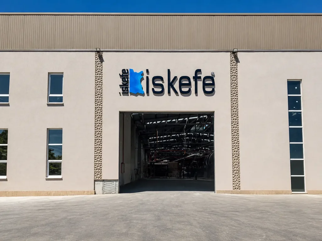
İskefe Industrial Building Signage
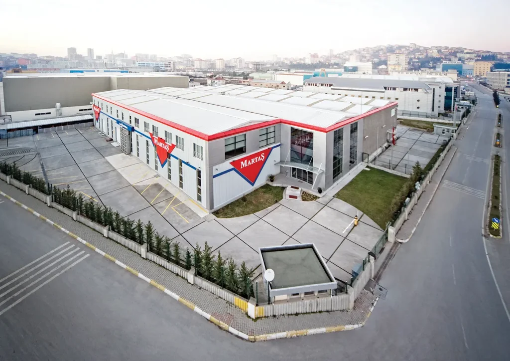
Martaş Factory Façade Signage

ÜNTES Monument Pylon Signage