THE PROJECT
A Monument Sign at the Office Entrance.
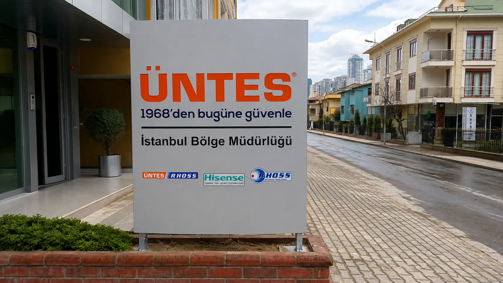
Boran Reklam created a freestanding entrance sign for the ÜNTES Istanbul regional office. The orange ÜNTES name leads the composition, followed by the company’s Turkish message, the regional office identification and a row of partner brand marks.
Placed beside the entrance and the street, the sign gives visitors a clear point of recognition before they reach the building.
1
Freestanding monument sign
4
Brand marks on the lower panel
2
Photographed viewing angles
Istanbul
Regional office identification
THE CHALLENGE
Clear Identification in a Busy Street Setting.
The sign needed to present several levels of information on one face: the principal ÜNTES identity, the Istanbul regional office name and supporting brand marks. The layout gives the orange wordmark the strongest visual weight while keeping the remaining information legible on approach.


THE SOLUTION
A Monument Sign Built Around a Clear Brand Hierarchy.
The sign places the orange ÜNTES name at the top, where it is immediately recognisable from the street. Beneath it, the Turkish message and “İstanbul Bölge Müdürlüğü” identify the location. A separate lower band gives the associated brand marks their own space.
The restrained light background helps the lettering and logos stand out without crowding the face.
MONUMENT SIGN DETAIL
Designed to Read from the Front and the Side.
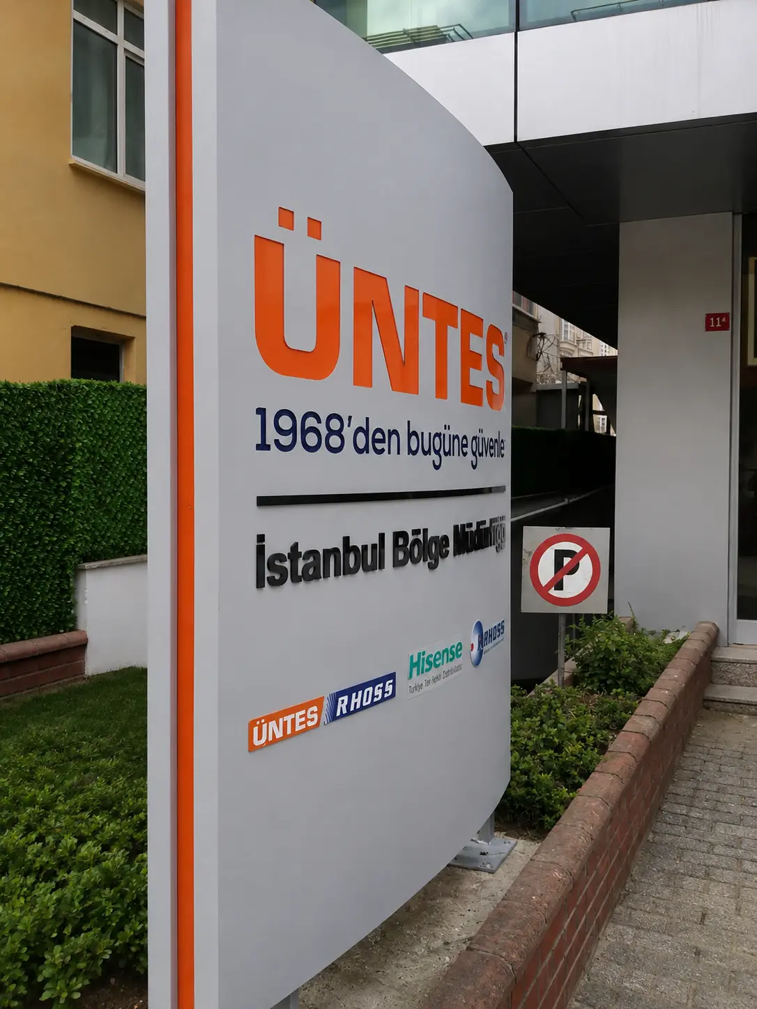
The front photograph shows the full hierarchy of the sign. A second, angled view reveals the depth of the freestanding structure, its orange side accent and the raised appearance of the lettering.
The light face contrasts with the orange ÜNTES wordmark and dark office lettering, helping each message remain distinct.
THE RESULT
A Clear Marker for the ÜNTES Regional Office.
The finished monument pylon signage marks the entrance to the Istanbul regional office. Its prominent ÜNTES identity can be seen from the street, while the office designation and brand marks provide useful detail as visitors move closer.
ENTRANCE VISIBILITY
One Sign, Two Useful Viewing Angles.
From the front, the sign reads as a complete brand and location marker beside the office entrance. The side view shows its physical presence and how the orange edge carries the identity around the structure.
Together, the photographs show a monument sign designed to work at both street and pedestrian scale.

FEATURED CASE STUDIES
Real Projects. Real Results.
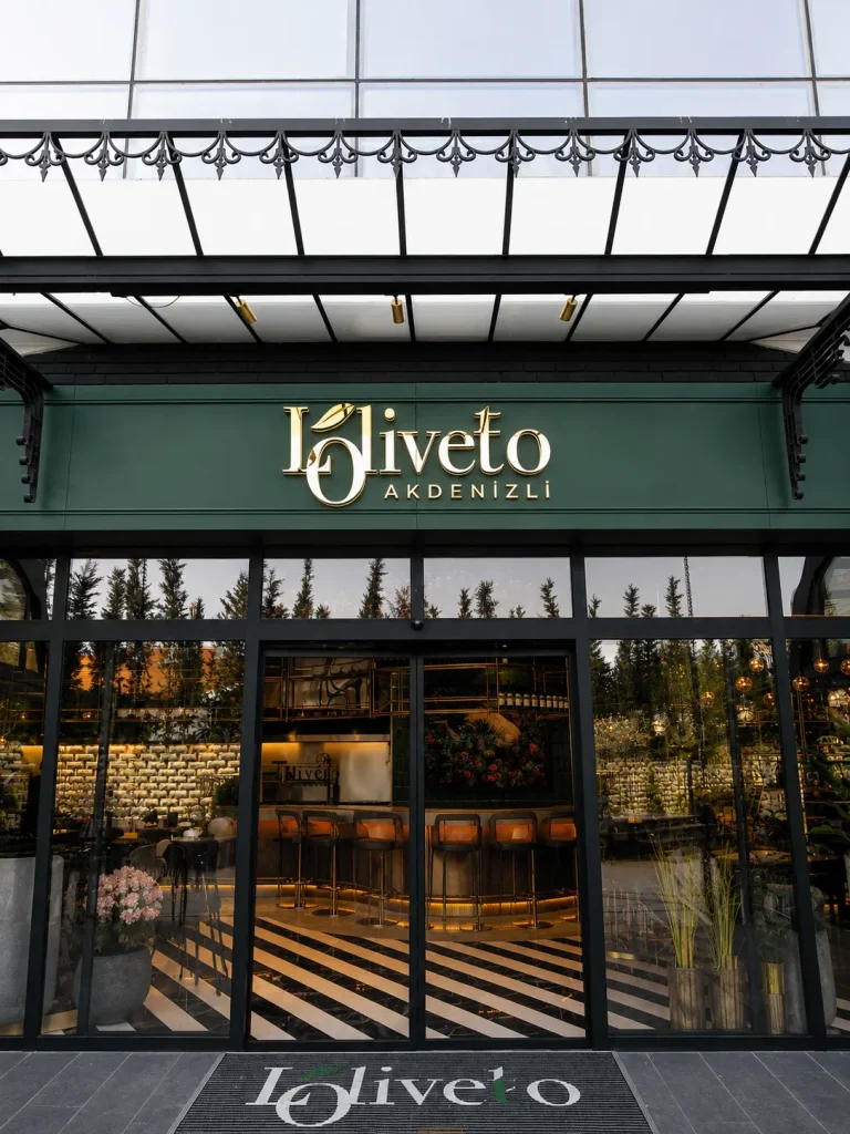
Loliveto Halo-Lit Signage
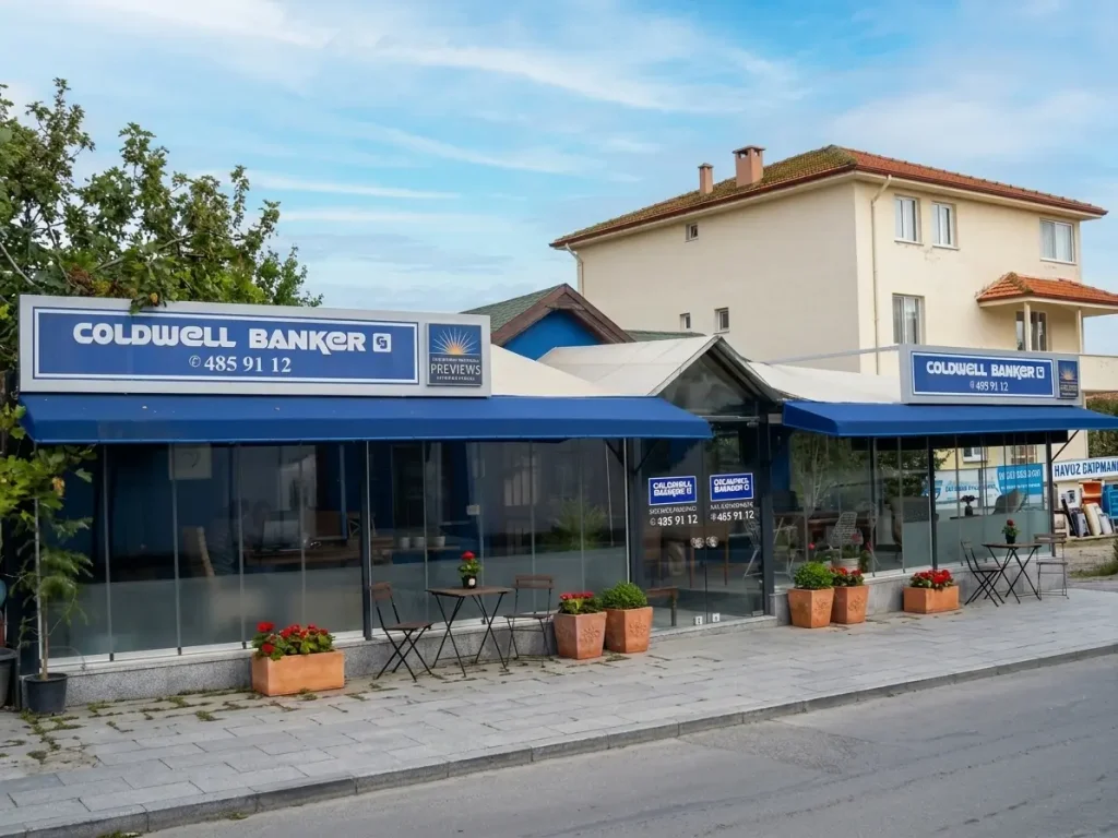
Coldwell Banker Custom Fascia Signage
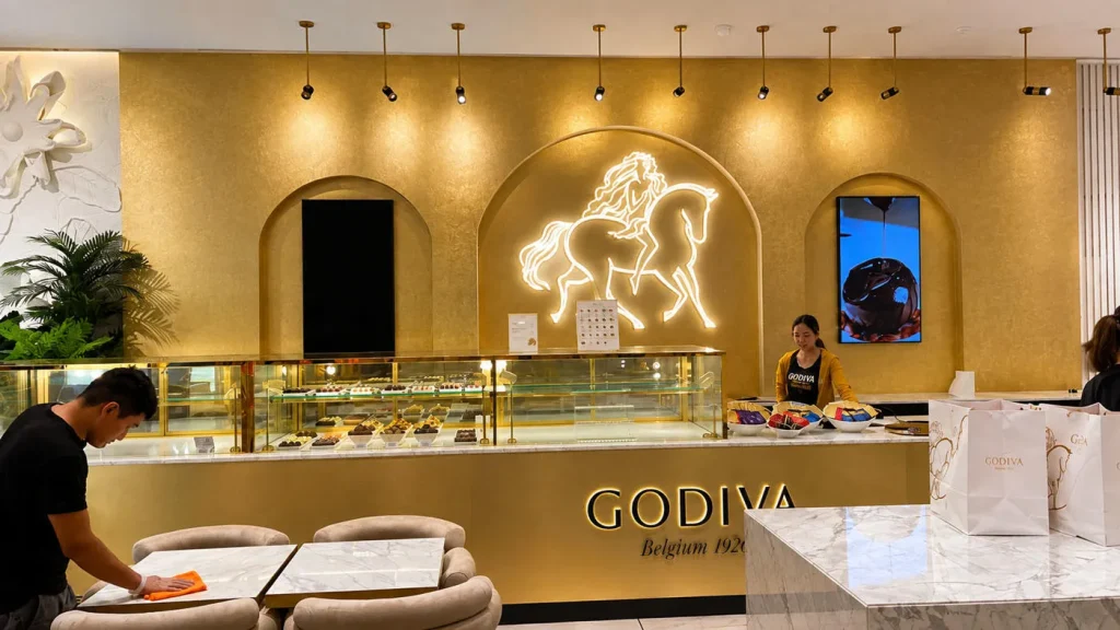
Godiva UAE Interior Signage & Metalwork

Technogym Astana Retail Graphics & Installation

Glatz Exhibition Graphics & Signage

Triathlon – Shopping Mall Signage & Lightbox Project
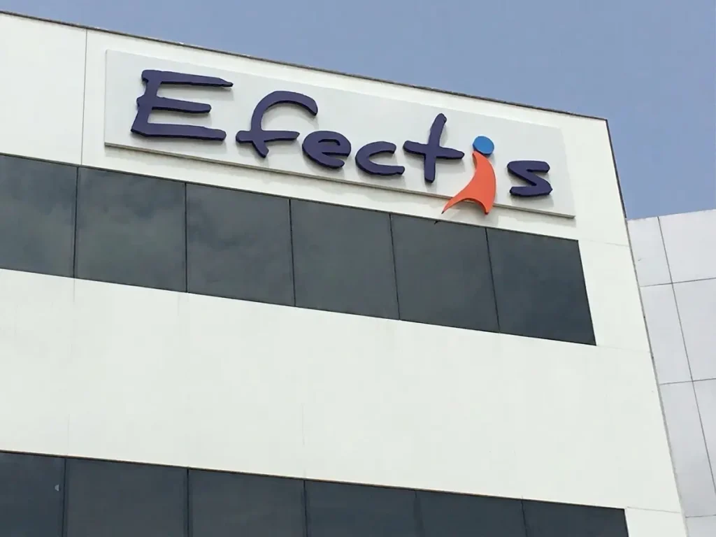
Efectis Factory Signage & Hand-Painted Logo
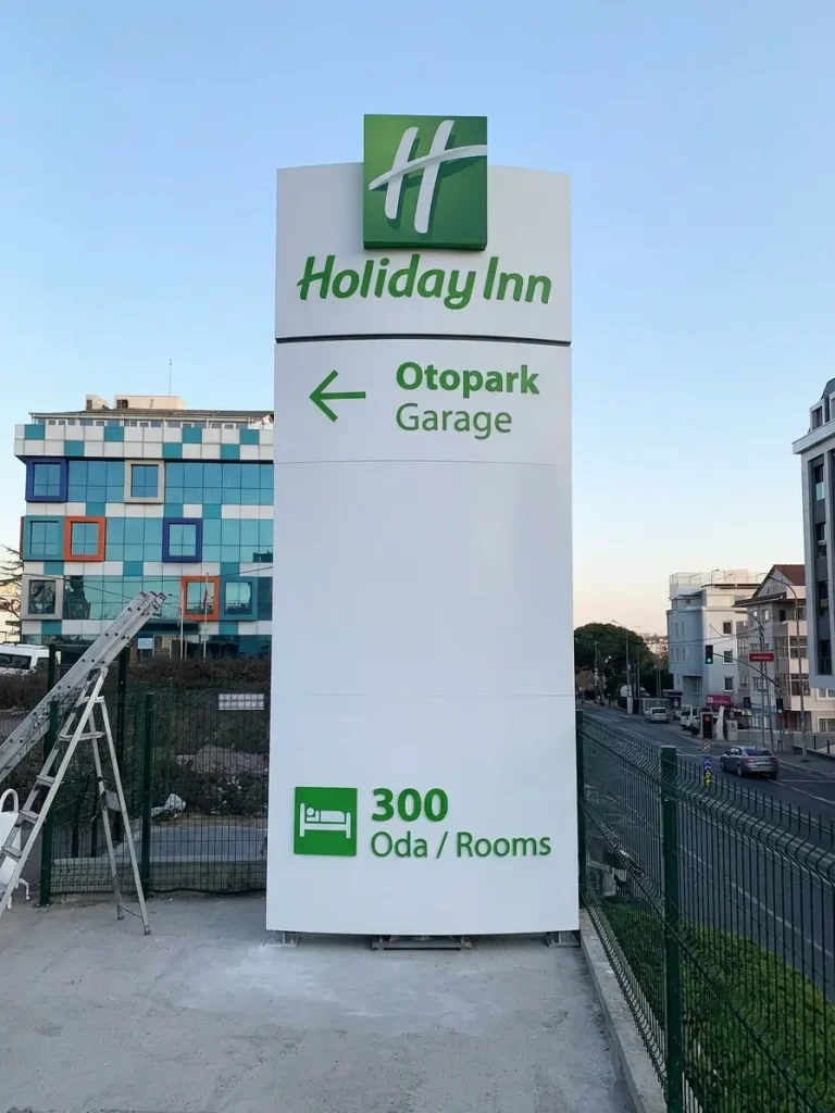
Holiday Inn Parking Pylon Sign
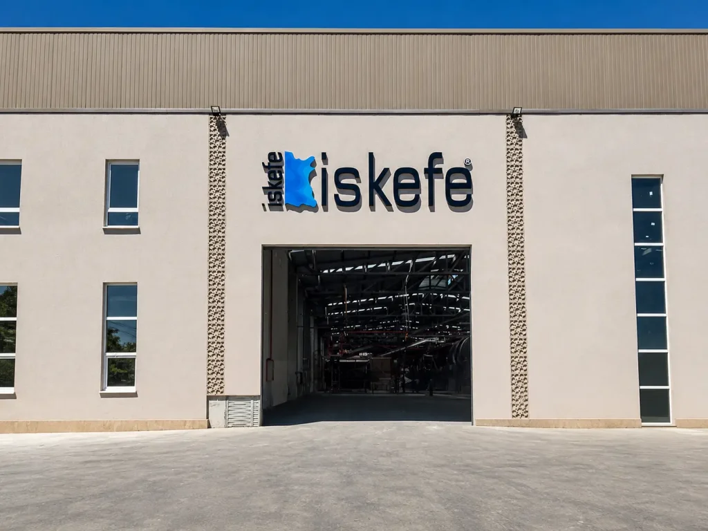
İskefe Industrial Building Signage
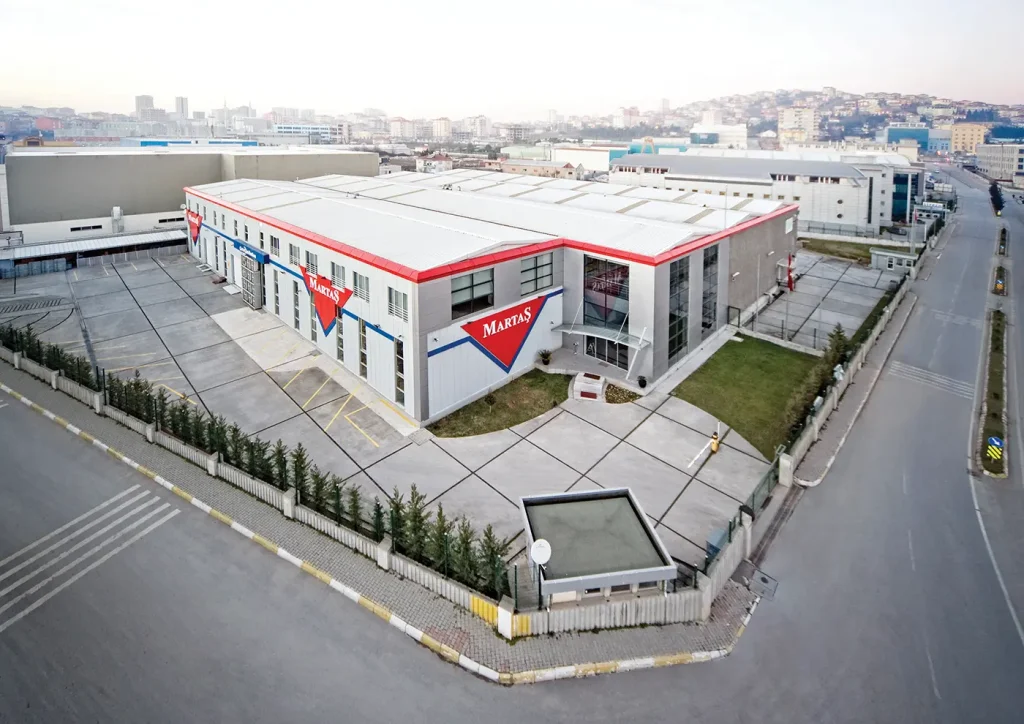
Martaş Factory Façade Signage

ÜNTES Monument Pylon Signage